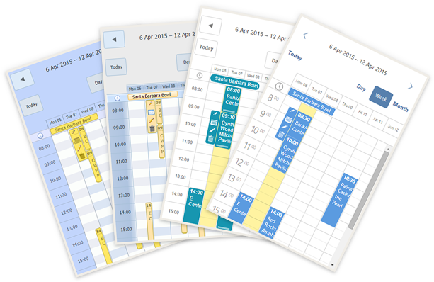
As you probably noticed, we've updated our website to use adaptive design and, hopefully, you already enjoy using it on mobile and tablet devices. We also adapted the live demos in the attempt to make them more user-friendly and touch-responsive. Here is an example of adaptive scheduler implemented in flat skin:
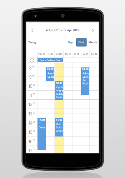
Due to the multiple requests made regarding Scheduler .NET responsiveness, we decided to share with you some code patterns to help you adapt your calendars to be used on touch devices.
Note: These are not the part of the official Scheduler package
How To Use?
1a. Download the files from here and unpack them into your project:
1b. or install them from NuGet
2. Add Content/dhtmlxScheduler/dhtmlxscheduler-responsive.css and Scripts/dhtmlxScheduler/dhtmlxscheduler-responsive.js to your page before DHXScheduler.Render() call
3. Add the following line to the server configuration:
scheduler.BeforeInit.Add(string.Format("initResponsive({0})", scheduler.Name));
That's it!
How It Works?
The solution consists of three files:
- dhtmlxscheduler-responsive.js
- dhtmlxscheduler-responsive.css
- dhtmlxscheduler-responsive-classic.css
The script file defines the global function initResponsive(scheduler) which amends the scheduler instance.
Each time scheduler is redrawn (initialized or refreshed after window resize), the code from dhtmlxscheduler-responsive.js checks the size of the window and switches calendar layout between 'default' and 'mobile' mode, which increases the height of navigation panel on top of the scheduler.
Additionally, it
- loads dhtmlxscheduler-responsive-classic.css if scheduler is initialized in Glossy or Standart skin (they require some custom styling)
CSS files contain several media queries, which makes scheduler elements more suitable for small screens.
You can find a couple of ready examples on NuGet: example in WebForms, example in MVC.
How To Modify It?
Here is a breakdown of the main parts of JS and CSS for better understanding how it works.
The text below is not necessary for usage of the code snippets, but may be useful in case you'd want to adjust them for your project.
dhtmlxscheduler-responsive.js
The script attaches itself to onBeforeViewChange event of the client-side component. An event fires each time the scheduler is displayed.
Inside the handler we check the size of the window and the skin that is currently applied. Then we set the height of the navigation pane on top of the scheduler (there are several sizes that has to be changed from code, the rest will be amended using CSS).
// regular header height for Terrace or Flat skin
var navbarHeight = 59,
	// regular header for Glossy or Standart skin
	navbarClassicHeight = 23,
	// height for Terrace and Flat in Mobile mode
	navbarMobileHeight = 130,
	// height for Glossy and Standart in Mobile mode
	navbarClassicMobileHeight = 140,

	// load QuickInfo if mobile browser detected
	loadQuickInfo = true,

	// navbar label formats for Regular and Mobile modes
	scaleDate = "%F, %D %d",
	scaleDateMobile = "%D %d";
// we’ll need to handle Glossy and Standart(classic) skins
// a bit differently from Terrace and Flat
var classic = { "glossy": true, "classic": true };

function setSizes(navHeight, navHeightClassicSkin, scaleDate) {
	scheduler.xy.nav_height = navHeight;

	if (classic[scheduler.skin]) {
		scheduler.xy.nav_height = navHeightClassicSkin;
	}

	scheduler.templates.week_scale_date = function (date) {
		return scheduler.date.date_to_str(scaleDate)(date);
	};
}

scheduler.attachEvent("onBeforeViewChange", function setNavbarHeight() {
	/* set sizes based on screen size */
	if (typeof scheduler !== "undefined") {

		if (window.innerWidth >= 768) {
			setSizes(navbarHeight, navbarClassicHeight, scaleDate);
		} else {
			setSizes(navbarMobileHeight, navbarClassicMobileHeight, scaleDateMobile);
		}
	}
	return true;
});
For Glossy and Classic skins we recommend nav_height 23 px and 140px to fit the phones. For Flat and Terrace use nav_height 59 px by default and 130px for phones. The height of nav_height panel can vary depending on the quantity of buttons.
This handler is needed to call a full redraw of the scheduler on resize of its container. It is needed to trigger calculations from the code above:
scheduler.attachEvent("onSchedulerResize", function () {
	scheduler.setCurrentView();
});
Set date format
It would be better to reduce the length of the date format in the subheader of the view for phones. For this purpose we have to override the date:
scheduler.templates.week_scale_date = function (date) {
return scheduler.date.date_to_str("%D %d")(date);
};
More information about formats of the Scheduler .NET can be found here.
Touch support
Scheduler .NET does not require any custom configuration for correct handling of touch input.
However, you may notice that the default event menu may be not very handy on tablets or smartphones while quite ok on desktops.
Fortunately, Scheduler provides an extension with a QuickInfo popup that does the same function.

So we keep the default menu on big screens and use QuickInfo for small ones.
function addJS(url, callback) {
	var head = document.getElementsByTagName('head')[0];
	var script = document.createElement('script');
	script.type = 'text/javascript';
	script.src = url;
	script.onreadystatechange = callback;
	script.onload = callback;
	head.appendChild(script);
}


if (/Android|webOS|iPhone|iPad|iPod|IEMobile/i.test(navigator.userAgent)) {
	addJS("../Scripts/dhtmlxScheduler/ext/dhtmlxscheduler_quick_info.js", function () {
		scheduler.config.touch = "force";
		scheduler.xy.menu_width = 0;
	});
}
The full code of dhtmlxscheduler_responsive.js:
function initResponsive(scheduler) {
		// regular header height for Terrace or Flat skin
	var navbarHeight = 59,
		//regular header for Glossy or Standart skin
		navbarClassicHeight = 23,
		// height for Terrace and Flat in Mobile mode
		navbarMobileHeight = 130,
		// height for Glossy and Standart in Mobile mode
		navbarClassicMobileHeight = 140,
		// load QuickInfo if mobile browser detected
		loadQuickInfo = true,
		// navbar label formats for Regular and Mobile modes
		scaleDate = "%F, %D %d",
		scaleDateMobile = "%D %d";
	// we’ll need to handle Glossy and Standart(classic) skins
	// a bit differently from Terrace and Flat
	var classic = { "glossy": true, "classic": true };


	function setSizes(navHeight, navHeightClassicSkin, scaleDate) {
		scheduler.xy.nav_height = navHeight;

		if (classic[scheduler.skin]) {
			scheduler.xy.nav_height = navHeightClassicSkin;
		}

		scheduler.templates.week_scale_date = function (date) {
			return scheduler.date.date_to_str(scaleDate)(date);
		};
	}

	scheduler.attachEvent("onBeforeViewChange", function setNavbarHeight() {
		/* set sizes based on screen size */
		if (typeof scheduler !== "undefined") {

			if (window.innerWidth >= 768) {
				setSizes(navbarHeight, navbarClassicHeight, scaleDate);
			} else {
				setSizes(navbarMobileHeight, navbarClassicMobileHeight, scaleDateMobile);
			}
		}
		return true;
	});

	scheduler.attachEvent("onSchedulerResize", function () {
		scheduler.setCurrentView();
	});

	scheduler.attachEvent("onTemplatesReady", function () {
		if (classic[scheduler.skin]) {
			addCss("../Content/dhtmlxScheduler/dhtmlxscheduler-responsive-classic.css");
		}
	});

	function addCss(source) {
		var cssFileTag = document.createElement("link");
		cssFileTag.setAttribute("rel", "stylesheet");
		cssFileTag.setAttribute("type", "text/css");
		cssFileTag.setAttribute("href", source);

		document.getElementsByTagName("head")[0].appendChild(cssFileTag);
	}

	function addJS(url, callback) {
		var head = document.getElementsByTagName('head')[0];
		var script = document.createElement('script');
		script.type = 'text/javascript';
		script.src = url;
		script.onreadystatechange = callback;
		script.onload = callback;
		head.appendChild(script);
	}


	if (/Android|webOS|iPhone|iPad|iPod|IEMobile/i.test(navigator.userAgent) && loadQuickInfo) {
		addJS("../Scripts/dhtmlxScheduler/ext/dhtmlxscheduler_quick_info.js", function () {
			scheduler.config.touch = "force";
			scheduler.xy.menu_width = 0;
		});
	}
}
Then we overide a little the scheduler css styles:
- Lightbox - sidebar, for displaying data which gives an ability to read and to edit data.
.dhx_cal_light .dhx_cal_light_wide {
    top: 25% !important;
}

.dhx_btn_set {
    margin-bottom: 20px !important;
}

.dhx_wrap_section .dhx_section_time {
    height: auto !important;
    width: 100%;
    -webkit-box-sizing: border-box;
    -moz-box-sizing: border-box;
    box-sizing: border-box;
}

.dhx_cal_light {
    -webkit-box-sizing: border-box;
    -moz-box-sizing: border-box;
    box-sizing: border-box;
}

@media screen and (max-width: 767px) {
.dhx_cal_larea {
        width: auto !important;
        margin-left: 0 !important;
        height: 100% !important;
    }

    .dhx_wrap_section, .dhx_cal_ltitle, .dhx_cal_larea {
        position: relative !important;
        display: block !important;
        overflow: initial !important;
    }

        .dhx_wrap_section .dhx_section_time {
            height: 100% !important;
        }

/*time period section*/
.dhx_section_time {
	display: inline-block;
	vertical-align: middle;
	min-height: 0;
	position: relative;
	width: inherit;
	height: auto !important;
	width: 100% !important;
}

	.dhx_section_time select {
		position: relative;
		min-height: 1px;
		float: left;
		width: 25%;
		margin-bottom: 5px !important;
    }

.dhx_cal_light {
        width: auto !important;
        height: auto !important;
    }

    .dhx_cal_light_wide .dhx_cal_lsection {
        text-align: left !important;
    }

    .dhx_cal_light_rec.dhx_cal_light_wide {
        width: 100% !important;
    }

        .dhx_cal_light_rec.dhx_cal_light_wide .dhx_cal_larea {
            width: 100% !important;
        }

    .dhx_form_repeat, .dhx_repeat_center {
        padding-left: 0 !important;
    }

    .dhx_cal_ltext {
        display: block;
        width: 100%;
        position: relative;
        padding: 0 !important;
        -webkit-box-sizing: border-box;
        -moz-box-sizing: border-box;
        box-sizing: border-box;
    }

    .dhx_btn_set {
        position: relative !important;
        display: inline-block !important;
    }
}

@media screen and (orientation : landscape) and (max-width: 767px) {
.dhx_cal_ltext {
        height: auto !important;
    }

        .dhx_cal_ltext textarea {
            height: 70px !important;
        }
}

@media screen and (max-width : 450px) {
/*lightbox time period section*/
    .dhx_section_time span {
        display: none;
    }

    .grey_section, .red_section {
        font-size: 12px !important;
    }

    /*light box edit text*/
    .dhx_cal_ltext {
        display: block;
        width: 100%;
        position: relative;
        padding: 0 !important;
        -webkit-box-sizing: border-box;
        -moz-box-sizing: border-box;
        box-sizing: border-box;
    }
}
- Panel with buttons - displays the tabs (views buttons) and buttons "Prev" and "Next".
.dhx_cal_tab {
    float: right;
}

@media screen and (min-width: 768px) and (max-width : 992px) {

    /*datetime of the scheduler in nav bar section*/
    .dhx_cal_date {
        font-size: 13px !important;
    }
}


@media screen and (max-width: 767px) {

    /*buttons in dhx_cal_navline class*/
    .dhx_cal_navline .dhx_cal_tab,
    .dhx_cal_navline .dhx_cal_today_button,
    .dhx_cal_navline .dhx_minical_icon {
        position: relative !important;
        right: auto !important;
        left: auto !important;
    }

    .dhx_cal_tab:hover, .dhx_cal_today_button:hover {
        text-decoration: none !important;
    }


    .dhx_cal_navline .dhx_minical_icon {
        display: inline-block;
        left: 80px !important;
        top: 80px !important;
    }

    .dhx_cal_navline .dhx_cal_date {
        display: block !important;
        left: 0 !important;
        width: 100% !important;
        text-align: center !important;
    }

    .dhx_cal_navline .dhx_cal_prev_button,
    .dhx_cal_navline .dhx_cal_next_button {
        z-index: 1;
    }

    .dhx_cal_navline .dhx_cal_prev_button {
        left: 0 !important;
        right: auto;
    }

    .dhx_cal_navline .dhx_cal_next_button {
        right: 0 !important;
        left: auto;
    }

    .dhx_cal_navline .dhx_cal_tab, .dhx_cal_today_button {
        top: 70px !important;
    }

    .dhx_cal_today_button {
        right: 0 !important;
        display: inline-block;
        float: left;
    }

    .dhx_cal_today_button,
    .dhx_cal_tab,
    .dhx_cal_prev_button,
    .dhx_cal_next_button,
    .dhx_cal_tab_standalone {
        width: 60px !important;
        height: 40px !important;
        -ms-border-radius: 4px !important;
        border-radius: 4px !important;
        margin: 4px 2px !important;
        padding: 0 !important;
        line-height: 40px !important;
    }
}

@media screen and (max-width : 450px) {
/*buttons in dhx_cal_navline class*/
    #scheduler_here div.dhx_cal_navline {
        display: inline-block !important;
        margin: 0 auto !important;
    }

    .dhx_cal_navline {
        text-align: center !important;
    }
}
- Reccuring events section in the Lightbox - a control area used to set values for reccuring events.
/*recurring events repeat event section in lightbox*/
.dhx_cal_light_rec.dhx_cal_light_wide {
    width: 738px !important;
}

    .dhx_cal_light_rec.dhx_cal_light_wide .dhx_cal_larea {
        width: 730px !important;
    }

.dhx_repeat_center, .dhx_repeat_right {
    width: auto !important;
}

.dhx_repeat_right {
    float: left !important;
}

@media screen and (max-width: 767px) {
/*recurring light box*/
    .dhx_form_repeat {
        overflow-y: auto !important;
        width: 100% !important;
    }

    .dhx_repeat_left, .dhx_repeat_center, .dhx_repeat_right {
        width: 100% !important;
        display: block !important;
        left: 0 !important;
        margin-right: 0 !important;
    }

    .dhx_repeat_divider {
        display: none;
    }
}
- Map view - view that displays a calendar with map (with data obtained from the Google Maps service).
.dhx_cal_data {
	height: 55% !important;
	width: 100% !important;
}

.dhx_map {
	position: absolute !important;
	display: block !important;
	width: 100% !important;
	height: 30% !important;
	float: left;
	margin: 0 !important;
	bottom: 0;
}

@media screen and (max-width: 767px) {
	.dhx_cal_data {
		overflow-y: auto !important;
	}
	.dhx_cal_data {
		height: 43% !important;
	}
}
- Grid view - view that displays items in a two-dimensional, scrollable grid.
@media screen and (max-width: 767px) {
	.dhx_grid_line div {
        width: 30% !important;
        margin: 0 !important;
        padding: 0 !important;
    }

    .dhx_grid_area tr.dhx_grid_event td {
        width: 30% !important;
        border-left: 1px solid #CECECE;
    }

        .dhx_grid_area tr.dhx_grid_event td.dhx_grid_dummy {
            border: none;
        }

    .dhx_grid_area table {
        width: auto !important;
    }

    .dhx_grid_v_border {
        display: none;
    }
}

@media screen and (max-width : 450px) {
	.dhx_grid_event td {
        width: auto !important;
    }

    .dhx_grid_event .dhx_grid_dummy {
        width: 1px !important;
    }
}
- 'Quick info' extension - uses for touch devices. This extension replaces standart sidebar editor.
@media screen and (max-width : 450px) {
	.dhx_cal_quick_info {
		left: 0 !important;
		padding-left: 0 !important;
		width: auto !important;
	}

	.dhx_cal_navline .dhx_minical_icon {
		left: 0 !important;
	}

	.dhx_cal_today_button,
	.dhx_cal_tab,
	.dhx_cal_prev_button,
	.dhx_cal_next_button,
	.dhx_cal_tab_standalone {
		width: 50px !important;
	}
}
- Year tooltip - uses in Year view panel shows show information about events.
@media screen and (max-width : 450px) {
	.dhx_year_tooltip {
        left: 0 !important;
    }
}
The full code of scheduler_responsive.css
/*nav bar*/
.dhx_cal_tab {
    float: right;
}
/*lightbox*/
.dhx_cal_light .dhx_cal_light_wide {
    top: 25% !important;
}
.dhx_btn_set {
    margin-bottom: 20px !important;
}
.dhx_wrap_section .dhx_section_time {
    height: auto !important;
    width: 100%;
    -webkit-box-sizing: border-box;
    -moz-box-sizing: border-box;
    box-sizing: border-box;
}
.dhx_cal_light {
    -webkit-box-sizing: border-box;
    -moz-box-sizing: border-box;
    box-sizing: border-box;
}
/*recurring events repeat event section in lightbox*/
.dhx_cal_light_rec.dhx_cal_light_wide {
    width: 738px !important;
}
    .dhx_cal_light_rec.dhx_cal_light_wide .dhx_cal_larea {
        width: 730px !important;
    }
.dhx_repeat_center, .dhx_repeat_right {
    width: auto !important;
}
.dhx_repeat_right {
    float: left !important;
}
/*grid view*/
tr.dhx_grid_event td {
    line-height: 1.8!important;
}
@media screen and (min-width: 768px) and (max-width : 992px) {
    /*datetime of the scheduler in nav bar section*/
    .dhx_cal_date {
        font-size: 13px !important;
    }
}
@media screen and (max-width: 767px) {
    /*buttons in dhx_cal_navline class*/
    .dhx_cal_navline .dhx_cal_tab,
    .dhx_cal_navline .dhx_cal_today_button,
    .dhx_cal_navline .dhx_minical_icon {
        position: relative !important;
        right: auto !important;
        left: auto !important;
    }
    .dhx_cal_tab:hover, .dhx_cal_today_button:hover {
        text-decoration: none !important;
    }
    .dhx_cal_navline .dhx_minical_icon {
        display: inline-block;
        left: 80px !important;
        top: 80px !important;
    }
    .dhx_cal_navline .dhx_cal_date {
        display: block !important;
        left: 0 !important;
        width: 100% !important;
        text-align: center !important;
    }
    .dhx_cal_navline .dhx_cal_prev_button,
    .dhx_cal_navline .dhx_cal_next_button {
        z-index: 1;
    }
    .dhx_cal_navline .dhx_cal_prev_button {
        left: 0 !important;
        right: auto;
    }
    .dhx_cal_navline .dhx_cal_next_button {
        right: 0 !important;
        left: auto;
    }
    .dhx_cal_navline .dhx_cal_tab, .dhx_cal_today_button {
        top: 70px !important;
    }
    .dhx_cal_today_button {
        right: 0 !important;
        display: inline-block;
        float: left;
    }
    .dhx_cal_today_button,
    .dhx_cal_tab,
    .dhx_cal_prev_button,
    .dhx_cal_next_button,
    .dhx_cal_tab_standalone {
        width: 60px !important;
        height: 40px !important;
        -ms-border-radius: 4px !important;
        border-radius: 4px !important;
        margin: 4px 2px !important;
        padding: 0 !important;
        line-height: 40px !important;
    }
    /*lightbox*/
    .dhx_cal_larea {
        width: auto !important;
        margin-left: 0 !important;
        height: 100% !important;
    }
    .dhx_wrap_section, .dhx_cal_ltitle, .dhx_cal_larea {
        position: relative !important;
        display: block !important;
        overflow: initial !important;
    }
        .dhx_wrap_section .dhx_section_time {
            height: 100% !important;
        }
    /*time period section*/
    .dhx_section_time {
        display: inline-block;
        vertical-align: middle;
        min-height: 0;
        position: relative;
        width: inherit;
        height: auto !important;
        width: 100% !important;
    }
        .dhx_section_time select {
            position: relative;
            min-height: 1px;
            float: left;
            width: 25%;
            margin-bottom: 5px !important;
        }
    /*scheduler data*/
    .dhx_cal_data {
        overflow-y: auto !important;
    }
    .grey_section, .red_section {
        font-size: 14px !important;
    }
    /*recurring light box*/
    .dhx_form_repeat {
        overflow-y: auto !important;
        width: 100% !important;
    }
    .dhx_repeat_left, .dhx_repeat_center, .dhx_repeat_right {
        width: 100% !important;
        display: block !important;
        left: 0 !important;
        margin-right: 0 !important;
    }
    .dhx_repeat_divider {
        display: none;
    }
    /*grid view*/
    .dhx_grid_line div {
        width: 30% !important;
        margin: 0 !important;
        padding: 0 !important;
    }
    .dhx_grid_area tr.dhx_grid_event td {
        width: 30% !important;
        border-left: 1px solid #CECECE;
    }
        .dhx_grid_area tr.dhx_grid_event td.dhx_grid_dummy {
            border: none;
        }
    .dhx_grid_area table {
        width: auto !important;
    }
    .dhx_grid_v_border {
        display: none;
    }
    /*lightbox*/
    .dhx_cal_light {
        width: auto !important;
        height: auto !important;
    }
    .dhx_cal_light_wide .dhx_cal_lsection {
        text-align: left !important;
    }
    .dhx_cal_light_rec.dhx_cal_light_wide {
        width: 100% !important;
    }
        .dhx_cal_light_rec.dhx_cal_light_wide .dhx_cal_larea {
            width: 100% !important;
        }
    .dhx_form_repeat, .dhx_repeat_center {
        padding-left: 0 !important;
    }
    .dhx_cal_ltext {
        display: block;
        width: 100%;
        position: relative;
        padding: 0 !important;
        -webkit-box-sizing: border-box;
        -moz-box-sizing: border-box;
        box-sizing: border-box;
    }
    .dhx_btn_set {
        position: relative !important;
        display: inline-block !important;
    }
    /*time bar*/
    .dhx_scale_bar {
        font-size: 9px !important;
    }
    .dhx_cal_tab p {
        display: inline-block;
    }
}
@media screen and (orientation : landscape) and (max-width: 767px) {
    /*lightbox*/
    .dhx_cal_ltext {
        height: auto !important;
    }
        .dhx_cal_ltext textarea {
            height: 70px !important;
        }
}

@media screen and (max-width : 450px) {
    /*date in nav bar section*/
    .dhx_cal_date {
        font-size: 14px !important;
        line-height: 3 !important;
        height: 40px !important;
        font-weight: normal !important;
    }
    /*lightbox time period section*/
    .dhx_section_time span {
        display: none;
    }
    .grey_section, .red_section {
        font-size: 12px !important;
    }
    /*light box edit text*/
    .dhx_cal_ltext {
        display: block;
        width: 100%;
        position: relative;
        padding: 0 !important;
        -webkit-box-sizing: border-box;
        -moz-box-sizing: border-box;
        box-sizing: border-box;
    }
    /*buttons in dhx_cal_navline class*/
    #scheduler_here div.dhx_cal_navline {
        display: inline-block !important;
        margin: 0 auto !important;
    }
    .dhx_cal_navline {
        text-align: center !important;
    }
    /*grid view*/
    .dhx_grid_event td {
        width: auto !important;
    }
    .dhx_grid_event .dhx_grid_dummy {
        width: 1px !important;
    }
    /*quick info extension*/
    .dhx_cal_quick_info {
        left: 0 !important;
        padding-left: 0 !important;
        width: auto !important;
    }
    .dhx_cal_navline .dhx_minical_icon {
        left: 0 !important;
    }
    .dhx_cal_today_button,
    .dhx_cal_tab,
    .dhx_cal_prev_button,
    .dhx_cal_next_button,
    .dhx_cal_tab_standalone {
        width: 50px !important;
    }
    /*year view - tooltip*/
    .dhx_year_tooltip {
        left: 0 !important;
    }
}
That's all amendments you have to do to the code to get a responsive design for terrace, flat, glossy and standart skins.